TL;DR: Most control rooms treat hydrocarbon and water dew point as slow-moving lab numbers — a sample pulled last Tuesday, a PVT report filed next month. But composition drifts, ambient temperature swings, and a single upstream swing can push your stream through its phase envelope in seconds. We just shipped an interactive, browser-based demo at kycis.com/dpcloud-demo that lets any engineer play control-room operator for ten minutes and see exactly how a live dew point calculation would change the way their alarms fire. This post walks through what the demo does, what it’s built on, and why “real-time” and “phase envelope” belong in the same sentence.
What a SCADA screen actually shows — and what it hides
If you have ever stood in a gas pipeline or LNG-train control room, you know what the screens look like. Long schematic pipelines, square blocks for separators and compressors, colored dots for pumps and valves, a handful of numeric tiles for pressure, temperature, flow, and maybe a totalizer. The visual language is deliberately dense and deliberately boring. An operator is supposed to read twenty values in a single glance, notice the one that changed, and not be distracted by animation or decoration.
This visual convention — the Supervisory Control And Data Acquisition, or SCADA, aesthetic — is the product of decades of human-factors research in process industries. Green means “operating within band.” Amber means “trend is drifting.” Red means “act now.” The layout is schematic rather than geographic because topology matters more than coordinates. The fonts are monospace because numbers need to update in place without shifting pixels sideways. None of this is accident.
But here is what most SCADA screens do not show, and what the industry has historically accepted as a limitation: phase behavior. A pressure tile tells you 5,200 kPa. A temperature tile tells you 14 °C. What neither tile tells you is whether, at this specific composition, those two numbers sit safely above the hydrocarbon dew line — or whether they are about to cross it.
Phase behavior is the difference between a pipeline moving dry gas and a pipeline accumulating liquid slugs. Between a custody-transfer meter measuring clean gas and a meter throwing off readings as two-phase flow hits the orifice. Between a filter-separator doing its job and one that is about to flood. Crossing a dew point rarely shows up first as a pressure excursion; it shows up as a mystery downstream — a plugged pigging run, a rich gas alarm at the tie-in, a custody dispute two weeks later.
The industry has always known this, and the traditional answer is a periodic PVT lab test: pull a sample monthly or quarterly, run a constant-composition expansion and a constant-volume depletion, fit an equation of state, hand the operator a paper report that says “stay above this line.” Good enough in 2005. Increasingly not good enough in 2026, as LNG swing flows, renewable-blend-in, and produced gas from unconventional plays make composition a moving target.
Why we built the demo
When we talk to pipeline operators, process engineers, and SCADA integrators about real-time dew point, the conversation usually stalls on the same gap: the engineer understands the physics, the operator understands the control-room workflow, but neither can picture the two married into a single screen. Our brochure describes it. Our API documentation proves it. But “imagine your HMI, but with a phase envelope updating every second” is an abstract claim until you have touched it.
So we built something you can touch. Not a video, not a mockup — a fully interactive, browser-based, SCADA-styled demonstration at kycis.com/dpcloud-demo. Open it on a laptop. Drag a temperature slider. Nudge the propane percentage. Watch the phase envelope morph in about 260 milliseconds. Watch the margin tile turn amber, then red. Watch the event log record the transition with a timestamp accurate to the second.
The goal is simple: convert “real-time hydrocarbon dew point” from a claim into an experience.
What the demo models
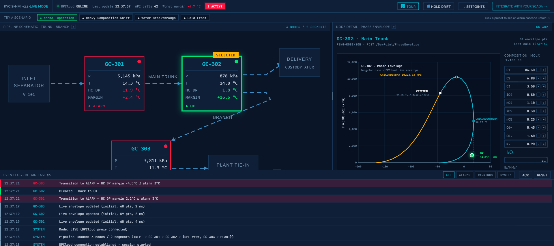
The demo simulates a three-segment pipeline: an inlet separator feeding a main trunk, with a branch tapping off to a plant tie-in. Three gas-chromatograph (GC) sampling points — tagged GC-301, GC-302, and GC-303 in industrial convention — sit at strategic positions along the network. Each node exposes the kind of data a real SCADA system would surface:
- Operating pressure and temperature (editable sliders)
- Full gas composition by component: C1 through C6+, plus CO2, N2, and water content (editable numeric inputs, auto-normalized to 100 mol%)
- Live hydrocarbon dew point in °C
- Live water dew point in °C
- Margin to operating temperature
- Live status: OK, WARNING, or ALARM
A pipeline-wide summary tile at the top tracks the worst-case margin across all three nodes, a session API-call counter, and an “online/offline” indicator for the calculation backend — a detail real SCADA operators look for unconsciously and one of the small authenticity cues the demo is built around.
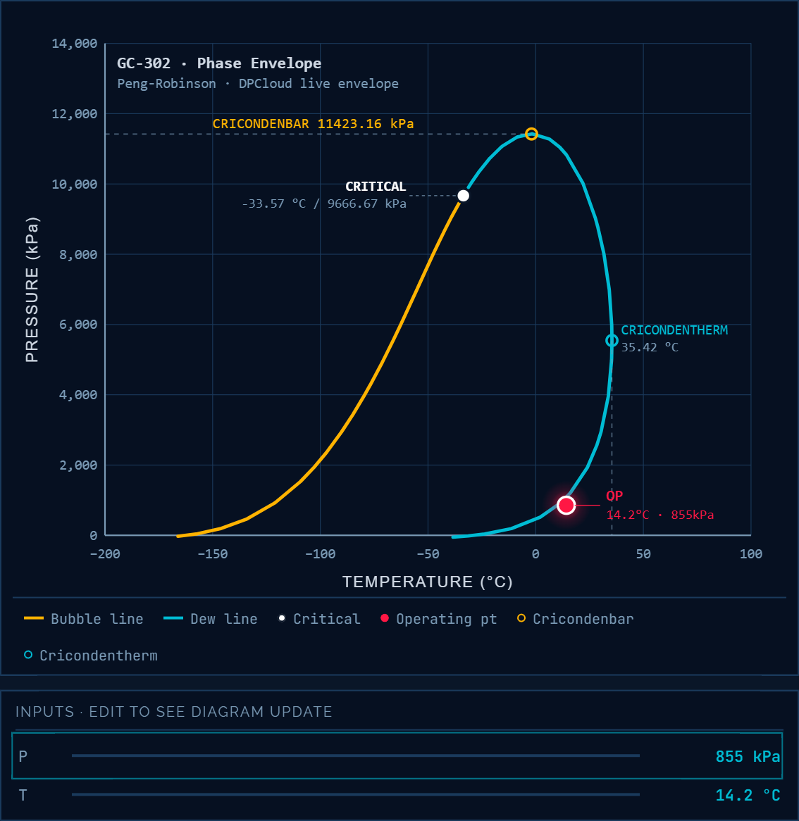
Below the schematic, the central panel shows the currently selected node’s full phase envelope — the Peng-Robinson two-phase boundary, critical point, cricondenbar, cricondentherm, and the operating point plotted as a single marker that moves with every change.
Below that, an event log scrolls in real time: every composition edit, every alarm transition, every envelope recalculation, each tagged with a timestamp and the GC node responsible. Event-log discipline is part of what makes SCADA SCADA; the demo leans into it unapologetically.
Four scenarios, each one a control-room story
The demo ships with four preset scenarios that load interesting states with a single click. Each is a story a control-room operator has lived through at least once.
Normal Operation is the baseline: all three nodes comfortably above their dew points, margins in the green, event log quiet except for drift updates.
Heavy Composition Shift injects a slug of C3+ enrichment at GC-302. Within seconds, the phase envelope for that node starts bulging to the right — cricondenbar rising, cricondentherm stretching upward. The margin narrows. The status chip goes from green to amber to red. The event log captures every transition with sub-second resolution:
12:27:19  GC-302  Transition to WARNING — HC DP margin 4.1°C ≤ warn 8°C
12:27:22  GC-302  Pipeline T nudged down 0.5°C
12:27:22  GC-302  Transition to ALARM — HC DP margin 3.5°C ≤ alarm 4°C
12:27:22  GC-302  Live envelope updated (cascade, 62 pts, 2 ms)
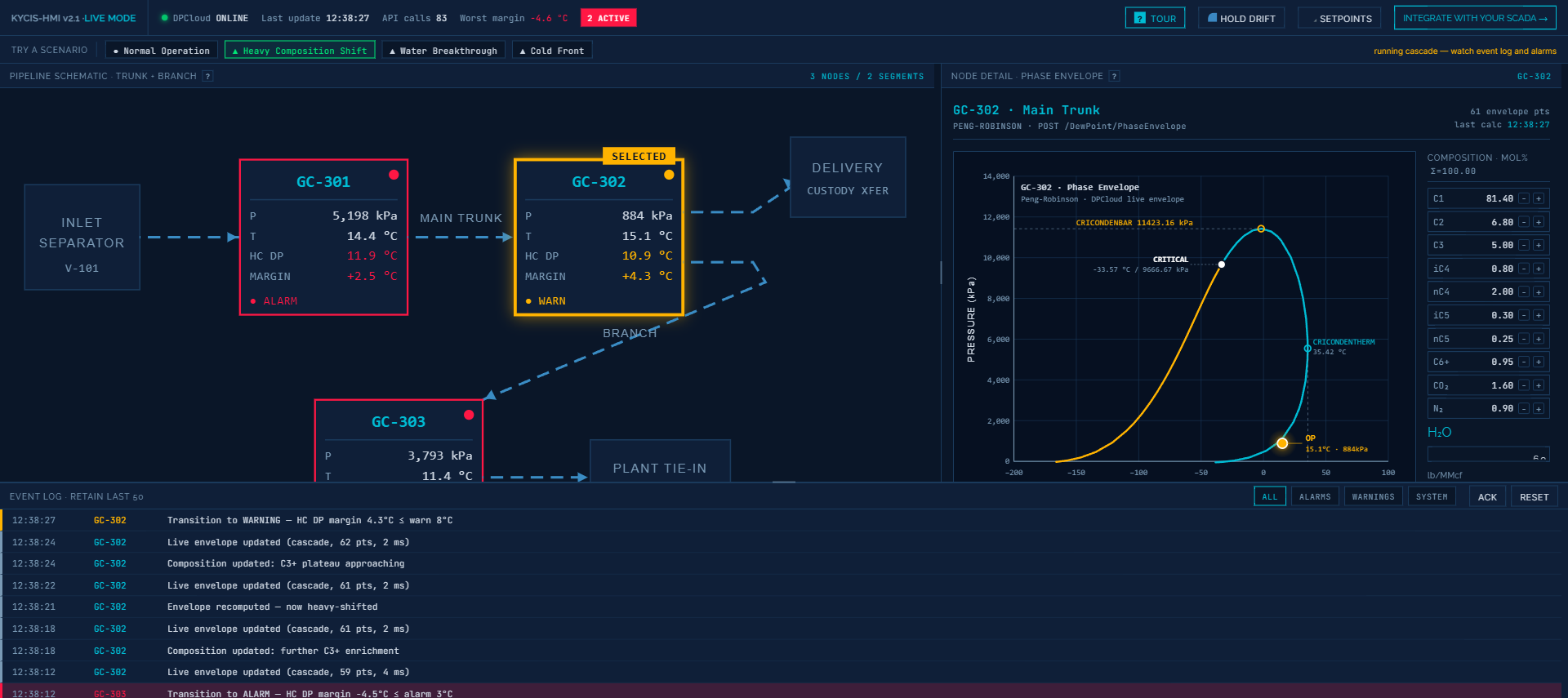
This is the canonical composition-drift story: upstream changes on the tens-of-seconds scale, classical SCADA only sees pressure and temperature holding steady, and the operator is flying blind until liquid shows up downstream.
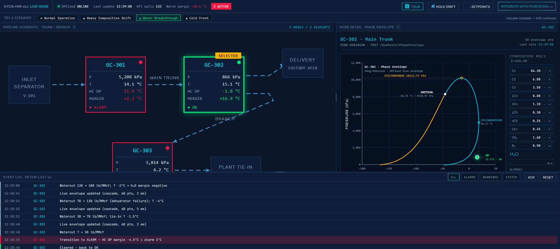
Water Breakthrough tells the other dew-point story. Watercut jumps from 30 to 70 lb/MMcf at the plant tie-in. The hydrocarbon envelope barely moves — it is a different physics — but the water dew point at GC-303 leaps from below freezing to +34 °C. Margin collapses from +14 °C to −24 °C in a single envelope update. Hydrate-formation risk, corrosion risk, glycol-regeneration stress: all of these live downstream of water dew point, and all of them are invisible to a SCADA that only tracks hydrocarbon parameters.
Cold Front simulates a 15 °C ambient drop across the entire pipeline. Everyone’s operating temperature drops. Everyone’s margin narrows simultaneously. Some nodes slip into WARNING, others hold. This is the seasonal story every pipeline operator in a continental climate has learned the hard way — dew point margin is not just about composition, it is about the gap between operating temperature and the dew line, and both sides of that gap move.
Each scenario runs in about 15–30 seconds and leaves the event log populated enough that an engineer can scroll through it and feel, not just read, how a composition swing propagates through a pipeline.
The punchline is latency
Every time you move a slider, the demo calls a real DPCloud calculation endpoint — not a prebaked lookup table, not a linear approximation. Behind the scenes, a Peng-Robinson equation of state is being solved for the dew point and the full two-phase envelope at the new composition. Typical latency, including network round trip from browser to API, is 2–15 milliseconds per calculation. The envelope you see redraw in the demo is the real calculated envelope, interpolated at 60 points and smoothly tweened between the old and new curves over about 260 ms so your eye can track the morphology change.
Why does millisecond-level latency matter? Three reasons:
Feedback loops demand speed. An operator investigating an amber margin tile is going to toggle things — try different setpoints, play with composition assumptions, ask “what if the propane runs hotter?” If the screen takes three seconds to respond to each nudge, the investigative flow collapses. At sub-100-ms, the phase envelope becomes an instrument the operator reasons with, not a report they wait for.
Drift is continuous, not episodic. Composition drifts second-by-second as upstream conditions change. A phase calculation that runs once per shift is a snapshot of conditions that stopped being true minutes after the sample was pulled. A calculation that runs every time new GC data arrives — which can be every 60 seconds or faster on modern online analyzers — is a live measurement that can anchor a live alarm.
Alarms only work if their setpoints are honest. A fixed “alarm if pipeline temperature < 5 °C” setpoint is a lagging proxy for “alarm if we are about to cross the hydrocarbon dew line.” Those two are the same only when composition never changes. Once composition is a variable, the honest alarm is on margin to dew point, recalculated whenever composition changes, which means dozens or hundreds of times per hour. Anything slower is an engineering estimate pretending to be a control-room limit.
From demo to real pipeline
The demo is intentionally a toy: no authentication, no saved state, a simulated pipeline, and calculation quotas on the free public endpoint. The production DPCloud service is something else: a REST API that integrates into existing SCADA and DCS systems as a side-car calculation service, pulls live composition from your GC feed, and publishes dew-point margin tiles back to your historian or HMI layer. It fits next to your control system without replacing any of it. Your operators keep looking at the same screens; those screens just start telling the truth about phase behavior.
The demo exists to close the imagination gap. If you are an engineer evaluating whether real-time dew point is worth the integration effort, spend ten minutes with the four scenarios. Trigger the cascades on purpose. Read the event log. Then open it again and show it to the operations lead. The conversation you have afterward is the one this blog post cannot finish for you.
DPCloud is built and operated by KYCIS Inc. The demo uses the same Peng-Robinson engine and REST interface that power production deployments in custody-transfer, pipeline-monitoring, and gas-plant applications.